 ? This video on Youtube best describes it and makes sense of the front and rear curtain, the mirror, shutter speed, aperture, the sensor... and how they all come together to take a picture for you when you press the shutter release button. The technology is fascinating especially at very high shutter speeds. Watch the video in slow motion by The Slow Mo Guys.
 Monday, 2 February 2015
Inside Your DSLR Camera - How It Works
Ever wondered what happens inside your DSLR camera? This video on Youtube best describes it and makes sense of the front and rear curtain, the mirror, shutter speed, aperture, the sensor... and how they all come together to take a picture for you when you press the shutter release button. The technology is fascinating especially at very high shutter speeds. Watch the video in slow motion by The Slow Mo Guys.
Copyrights © Matt Blythe 2015.
? This video on Youtube best describes it and makes sense of the front and rear curtain, the mirror, shutter speed, aperture, the sensor... and how they all come together to take a picture for you when you press the shutter release button. The technology is fascinating especially at very high shutter speeds. Watch the video in slow motion by The Slow Mo Guys. Monday, 5 January 2015

Tuesday, 18 November 2014
Printing Your Photographs - RGB or CMYK?
Lots of commercial printers use CMYK colour space which will print out differently if the image mode being printed is RGB. If the printer uses CMYK colours, changing the image mode to CMYK gives a closer representation of what the print out will actually look like. Also if you "calibrate" your monitor it can help with printing colours but not all printers use the same colour profiles or the same ink.
Trying to print an image that is rendered in RGB on a printer that uses CMYK is a bit like trying to see what the weather is doing by looking through a window covered by net curtains. If you are using professional printers you need to be aware what colour space they are using. Saving your image in RGB is fine if you are printing at home on an all-in-one home/office printer but if your printer uses CMYK it will affect the way the image looks and this could be significantly different from the way it looks on your computer screen.
This is a quote form the Jessops website:-
This explains why so often photographs we print don't always come out how we see them on the monitor: the printer software is converting the RGB colour space to CMYK. If you are planning to pop into the local printers tomorrow, try asking them if they accept images in the CMYK colour space. Also calibrate your monitor (if that is even possible) which will give you a better idea how your images will come out. There are certain situations when you have to convert to CMYK and most professionals in the media/printing industry understand this. That is exactly why companies like Jessops print in CMYK and do the conversion from RGB for you. If you are happy printing at home or with a "near enough" conversion from RGB to CMYK go ahead. RGB will be adequate for most "best practices". RGB (red, green, blue) is an additive system (add colours together to get white) whereas CMYK (cyan, magenta, yellow, black) is a subtractive system (add colours together to get black). This is why all printers are CMYK and all monitors are RGB.
However, when I send book files to the printers for publishing they must be in CMYK . I have to work on the files and render them in CMYK to know "exactly" what they are going to look like when they come off the press. My company even have a disclaimer saying if you upload images in RGB it will cause colour problems and they will not take responsibility for them. Printing from RGB isn't even an option for most publishing professionals. Images are rendered in RGB and printers print in CMYK , there has to be a conversion somewhere.
I can print framed photography prints of high resolution RGB no problem, but I cannot afford book covers coming back from the printers with dull colours or anything less than they looked on the screen, or as near as my screen is to calibrated anyway. That is why all the files I upload for publishing are print-ready PDF's with CMYK embedded high resolution images.
The point is, if I open the file in CMYK like I should, I don't need to convert the file from RGB to CMYK. If I forget or I am busy and I use sRGB then I need to convert the files to US Web Coated (SWOP) v2 (a CMYK profile), and then have to retouch the images because the colours lose vividness during the conversion, a loss I don't need coming back from the printers.
I primarily print paperback full colour covers on glossy finish.My printers won't even accept lossy conversions from RGB and they are one of the biggest companies in the publishing industry. When I upload files to the web the best results are RGB. When I upload to the printers they have to be in CMYK (talking from years of experience). Regarding which profile is best for printing, sRGB (standard red, green, blue) or aRGB (Adobe red, green, blue), it doesn't really matter as far as the printer is concerned because they are converted to CMYK anyway, although some will prefer one or the other depending what software they use for the conversion. Photoshop loves CMYK and PDF's and can handle the conversion no problem. But if you render the files in the same CMYK profile that the printers use there will not be any conversion, which means no losses of colour integrity - you get what you see on the screen - more or less. More than RGB gives you anyway.
From wikipedia (in American):-
"The Adobe RGB (1998) color space is an RGB color space developed by Adobe Systems, Inc. in 1998. It was designed to encompass most of the colors achievable on CMYK color printers, but by using RGB primary colors on a device such as a computer display. The Adobe RGB (1998) color space encompasses roughly 50% of the visible colors specified by the Lab color space – improving upon the gamut of the sRGB color space, primarily in cyan-green hues."
The mistake people make is that RGB looks better on the screen but loses colour when converting to CMYK so most people do not use CMYK for that reason. Which is understandable. RGB is fine for most applications. However, working on the file and saving in CMYK would prevent such losses that might be incurred from the printers. Keeping in mind all physical printers use different inks and have different hardware and colour profiles so no two printers will ever give the same results. That's why I say (with tongue in cheek) "calibrate your monitor" because of course you can't accurately calibrate your monitor any more than you can calibrate your own vision. Or calibrate reality for that matter.
That's why we have guidelines and goal posts and if you kick the ball somewhere between the goal posts you are likely to get the result you want... more or less accurately depending on the integrity of the printer you are using. I imagine with today's technology the RGB-to-CMYK conversion is pretty good, although I know for fact some photography prints come back less vividly than the images that got sent out, a problem I don't have when designing book covers thankfully.
"My principle is this: if it looks good it worked.
So I must have done something right."
Talking of which, the finished cover design for Vitor Rodrigues' new book is now ready for uploading to the printers. Coming to a bookshop near you soon. This is a RGB jpeg for uploading to the internet, the print-ready file is a CMYK layered / embedded PDF.
As a general rule, RGB is better for displaying on the internet (on a web page for example) and CMYK is better for lossless printing. Choose whatever is best for you :)
Matt Blythe.

Trying to print an image that is rendered in RGB on a printer that uses CMYK is a bit like trying to see what the weather is doing by looking through a window covered by net curtains. If you are using professional printers you need to be aware what colour space they are using. Saving your image in RGB is fine if you are printing at home on an all-in-one home/office printer
but if your printer uses CMYK it will affect the way the image looks and this could be significantly different from the way it looks on your computer screen.This is a quote form the Jessops website:-
"To meet the requirements of as many customers as possible, we base our automatic workflow on sRGB colours that are then converted to the outputting systems with the help of ICC profiles. For digital printing processes we convert the sRGB colours to the CMYK colour space shortly before printing.
"Jessops Photo Software allows for embedded RGB-ICC Profiles. Images in AdobeRGB, ECI-RGB or ProPhotoRGB colour space will be interpreted correctly in these software versions.
"If you send us your images in any other colour space, we are suggesting the following steps to ensure the optimal colour results: Convert your images to sRGB (e.g. in Adobe Photoshop go to "Edit" and then "Convert to Profile"). Afterwards please integrate your images into the layout of your Jessops Photo product."
This explains why so often photographs we print don't always come out how we see them on the monitor: the printer software is converting the RGB colour space to CMYK. If you are planning to pop into the local printers tomorrow, try asking them if they accept images in the CMYK colour space. Also calibrate your monitor (if that is even possible) which will give you a better idea how your images will come out. There are certain situations when you have to convert to CMYK and most professionals in the media/printing industry understand this. That is exactly why companies like Jessops print in CMYK and do the conversion from RGB for you. If you are happy printing at home or with a "near enough" conversion from RGB to CMYK go ahead. RGB will be adequate for most "best practices". RGB (red, green, blue) is an additive system (add colours together to get white) whereas CMYK (cyan, magenta, yellow, black) is a subtractive system (add colours together to get black). This is why all printers are CMYK and all monitors are RGB.
However, when I send book files to the printers for publishing they must be in CMYK . I have to work on the files and render them in CMYK to know "exactly" what they are going to look like when they come off the press. My company even have a disclaimer saying if you upload images in RGB it will cause colour problems and they will not take responsibility for them. Printing from RGB isn't even an option for most publishing professionals. Images are rendered in RGB and printers print in CMYK , there has to be a conversion somewhere.
I can print framed photography prints of high resolution RGB no problem, but I cannot afford book covers coming back from the printers with dull colours or anything less than they looked on the screen, or as near as my screen is to calibrated anyway. That is why all the files I upload for publishing are print-ready PDF's with CMYK embedded high resolution images.
The point is, if I open the file in CMYK like I should, I don't need to convert the file from RGB to CMYK. If I forget or I am busy and I use sRGB then I need to convert the files to US Web Coated (SWOP) v2 (a CMYK profile), and then have to retouch the images because the colours lose vividness during the conversion, a loss I don't need coming back from the printers.
I primarily print paperback full colour covers on glossy finish.My printers won't even accept lossy conversions from RGB and they are one of the biggest companies in the publishing industry. When I upload files to the web the best results are RGB. When I upload to the printers they have to be in CMYK (talking from years of experience). Regarding which profile is best for printing, sRGB (standard red, green, blue) or aRGB (Adobe red, green, blue), it doesn't really matter as far as the printer is concerned because they are converted to CMYK anyway, although some will prefer one or the other depending what software they use for the conversion. Photoshop loves CMYK and PDF's and can handle the conversion no problem. But if you render the files in the same CMYK profile that the printers use there will not be any conversion, which means no losses of colour integrity - you get what you see on the screen - more or less. More than RGB gives you anyway.
From wikipedia (in American):-
"The Adobe RGB (1998) color space is an RGB color space developed by Adobe Systems, Inc. in 1998. It was designed to encompass most of the colors achievable on CMYK color printers, but by using RGB primary colors on a device such as a computer display. The Adobe RGB (1998) color space encompasses roughly 50% of the visible colors specified by the Lab color space – improving upon the gamut of the sRGB color space, primarily in cyan-green hues."
The mistake people make is that RGB looks better on the screen but loses colour when converting to CMYK so most people do not use CMYK for that reason. Which is understandable. RGB is fine for most applications. However, working on the file and saving in CMYK would prevent such losses that might be incurred from the printers. Keeping in mind all physical printers use different inks and have different hardware and colour profiles so no two printers will ever give the same results. That's why I say (with tongue in cheek) "calibrate your monitor" because of course you can't accurately calibrate your monitor any more than you can calibrate your own vision. Or calibrate reality for that matter.
That's why we have guidelines and goal posts and if you kick the ball somewhere between the goal posts you are likely to get the result you want... more or less accurately depending on the integrity of the printer you are using. I imagine with today's technology the RGB-to-CMYK conversion is pretty good, although I know for fact some photography prints come back less vividly than the images that got sent out, a problem I don't have when designing book covers thankfully.
So I must have done something right."
Matt Blythe.
Talking of which, the finished cover design for Vitor Rodrigues' new book is now ready for uploading to the printers. Coming to a bookshop near you soon. This is a RGB jpeg for uploading to the internet, the print-ready file is a CMYK layered / embedded PDF.
As a general rule, RGB is better for displaying on the internet (on a web page for example) and CMYK is better for lossless printing. Choose whatever is best for you :)
Matt Blythe.
Click the image to enlarge.
Copyrights © Matt Blythe 2014.
Friday, 29 August 2014
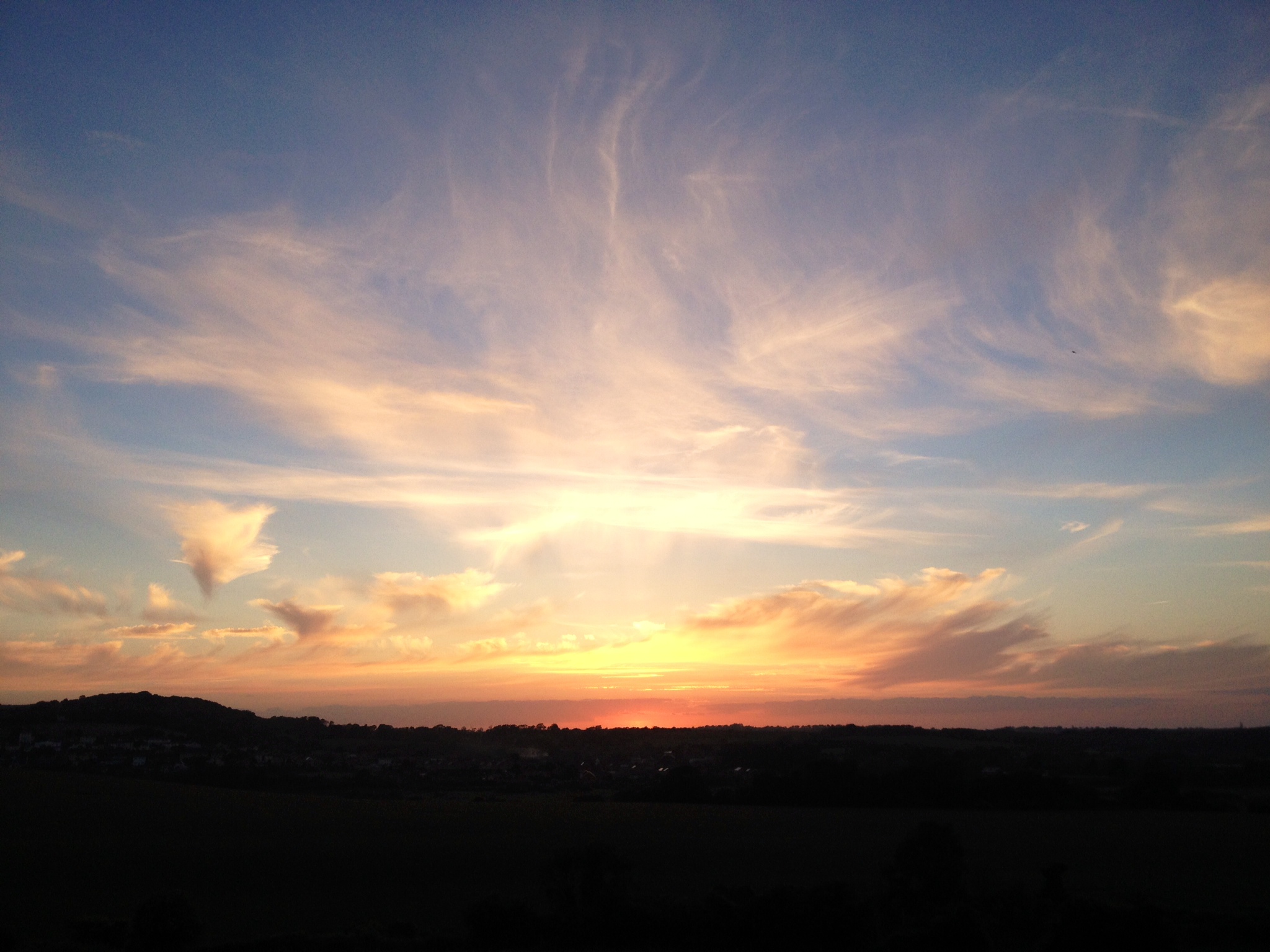
Photography With the Apple iPhone
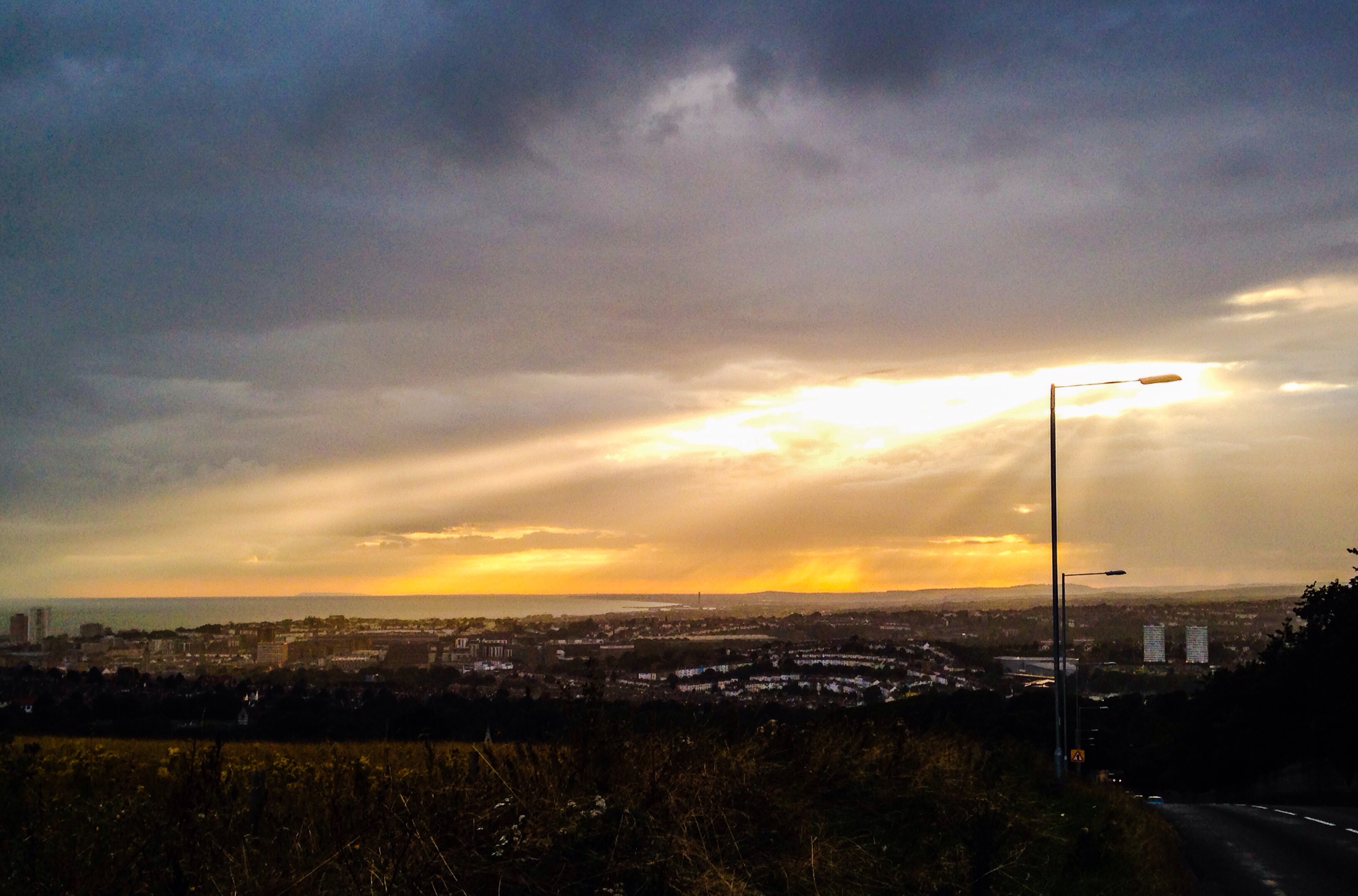
This image of the sun bursting through clouds was taken from Brighton Racecourse. The street light gives the impression that it is illuminating the whole of Brighton. Awesome!
The iPhone isn't really up to a lot of zoom and the image becomes quite grainy, quite quickly, in proportion to the amount of zoom you use, and most of the foreground was in dark shadow. As far as I know the iPhone is 'aperture priority' in that it adjusts the exposure by increasing the shutter speed and always uses the same f stop number 2.4 and the lowest ISO possible, which is somewhere between 50 and 800 (with the 4S model) and 3200 with the iPhone 5, so there isn't much scope for landscapes where you want depth of field and sharp focusing across the image by using a bigger f stop number (smaller aperture).
However, if you are out and about and you see an awesome sunset - and an iPhone is all you have handy - you can still take some pretty impressive shots with the 8mp front camera. This image was enhanced using the Adobe Photoshop Express App for iPhone, which is a bit basic, but OK for a phone app if you just want to make quick adjustments to things like contrast and brightness.
Another trick I discovered with iPhone (and most digital cameras) is that if you take the photograph in low light but turn the flash off, because the iPhone is auto-everything, it compensates for the low light by decreasing the shutter speed and increasing the ISO. The result is the picture is brighter and more vivid than it would have been in bright light or with the flash on.
You can also adjust exposure on the iPhone by tapping the screen before you take the photograph. Tapping the screen selects the point you want to focus on and also exposes the image for that area, so the exposure can be adjusted somewhat by tapping lighter or darker areas of the image. If one thing can be said about the iPhone camera, it is that it is versatile across a broad spectrum of lighting conditions.
See the images below for more photography taken with the iPhone (click the images to enlarge). To view all iPhone photographs in this set click here.


Sunday, 17 August 2014
New Facebook Page ~ Please Like
Trying out the Facebook embed code... come and like our new page on Facebook :)
Inner Vision Photography
Copyrights © Matt Blythe 2014.
Inner Vision Photography
Copyrights © Matt Blythe 2014.
Subscribe to:
Posts (Atom)